A Technology Plan (Limited!)

I have so many thoughts about using technology more advantageously with my students in the upcoming year, based upon both this class and the Introduction to Digital Tools.  It seems fitting that I am using Edublogs to post this final blog for our class because the aspect of planning I wish to address that relates to occupational practice is, in fact, blogging.

For three years now, I have required blogging of my students.  When I initiate the same requirement this year, I will do so with a more nuanced and systematic approach based upon my awareness of planning.  First of all, my personal survey  will ask students to share where they are now in terms of their use of technology and their comfort-level.  Doing so should help me not only assess “where we are,” but also help find student-leaders who can assist their peers. I will share with them the affordances and rationale behind blogging in a more transparent way and spend a class (or classes—as the requirements become more demanding) showing them how edublogs works.  (Examples of this include hyperlinks and activating certain widgets—particularly the class widget to afford them easy access to their peers’ blogs.)   I have never truly instructed for its affordances to be clear.  If I expect the activity to be embraced and appreciated, I must begin here.

In addition, I need to spend time instructing in appropriate and useful comments.  Because the course specifically requires that students interact and develop ideas based upon readings, the importance of interaction outside of class in response to readings must be a focus of this plan.  In a pertinent blog post from the Macmillan online community, I read an interesting explanation, “300/100/X2Q,” which I will use with my college students.  Each response must be about 300 words; they must respond to two of their peers in approximately 100 words; and they must ask a question to further discussion of each of those posts to which they respond.  Obviously this is less about the tech, and more about the planning, but the tech, after all, should serve the learning objectives.

Furthermore, blogs will become integral to class discussions, rather than ancillary, or merely as showcases of final work.  I want the blogs to show the thinking about the readings and to be useful indicators that the readings are being done before students arrive.  If a target is that students come prepared for class, then blogs become evidence of that.  This is one of the targets I am particularly interested in addressing.

Another target is that the blogs extend the classroom walls, so I have reached out to other professors teaching the same class in hopes that they will embrace the possibilities of a widened dialogue.  This target is more difficult to attain primarily because it requires a coordinated sequence of readings in order that the students have a shared subject.  We will see if this happens.  At this point, neither of the two professors  with whom I’ve discussed this possibility has gotten back to me—which brings me to a larger point.

Despite the fact that we know technology is available and that most of our students, at the very least, are using their phones as on-the-spot computers, we need to figure out a way to leverage that knowledge for more engagement and learning.  Edublogs, as a platform, has done everything in its power to help me do that.  It has mobile-friendly designs (yet another affordance that I must include in instruction) to capitalize on the students’ access.  I will be checking in with the students to see how they are reacting to this plan, and certainly will be revising based upon what I witness in the class, particularly regarding engagement.  Teaching demands constant revision.  Technology only adds another layer to that.

A 60-Second iMovie (That Took 6 Hours to Create!)

Taxes at Work  from Patricia Emerson on Vimeo.

This video of recycling pick-up pays homage to the bi-weekly task of public works employees who make sure our suburban streets maintain their pristine appearance.  Having just returned from a country that lacks the infrastructure and services that we so often take for granted, and even more often bemoan their cost, I can say that it is money well-spent.  I hope I say that here.  My storyboard is available with a brief description of the shots I tried to incorporate.  The scenes, their sequence,  are clear, yes?

WEEK FOUR: IMAGES, COLOR, AND IMPACT

OLYMPUS DIGITAL CAMERAI am using a free online photo editor, REBBIT, and its options are not huge, but I did get to play enough with color and width choices, as well as shape, to understand the effect that edge treatments have on the overall impact of an image.  Here the “polaroid” effect detracts from the simplicity of the shot, but I like the blue to pick up the color in the bike seat, handlebar grips, and bricks, which lost a lot of gray with this edge treatment (new term: spontaneous contrast).

OLYMPUS DIGITAL CAMERAHere the border frame is partial, corners only, but still trying to work with the effect of blue.  As I deepened the corners, adding more edge, less photo, the importance shifted back to the bike, a bit like a telescope.

OLYMPUS DIGITAL CAMERAThis “museum” framing effect looks better at the site than in the transfer.  The vertical edges should be the same width as the top and the bottom.  The brown draws less attention to itself and goes well with the brown of the tires and the soft yellows and deeper gold color of the bike frame.  The entire scene, menu, pots, bike, appears more even in value in this frame.  Yes, the bike is the focal point, but it seems a part of the larger scene.

OLYMPUS DIGITAL CAMERAThis is a variation on the museum framing idea.  Once again, the vertical edges are misrepresented here.  What I notice about this frame’s effect is the way the color of the bicycle frame “pops” because of the addition of the color in the border.  I really like the effect.

OLYMPUS DIGITAL CAMERAIn the last paragraph of the exercise, Krause says, “And remember: a border’s role is (almost always)to enhance the image it surrounds–avoid adding a border that calls too much attention to itself” (p.197).  Obviously this is an example of a border that, in tone, bears absolutely no connection to the bicycle even though the candy corn hues aren’t jarring against the colors and hues of the photograph.  It was only after I completed the reading today about working with images, that I revisited the original photo and decided to experiment with “tight cropping.”  As White Space Is Not Your Enemy advised on page 134, “Extreme tight crops and close-ups are particularly interesting, as they force us to look at the subject in a new way”  (Golombisky &  Hagen).  When I cropped and zoomed with this idea in mind, the bike disappeared and the reason that the candy-corn frame serendipitously has some merit, emerges, as you can see below.  (I am sure that it was the sign that prodded, “Take this shot!”  What a great way to remember our day in Rome.)

OLYMPUS DIGITAL CAMERA


The idea that a different picture emerges when one plays with framing and particularly cropping, is part of what creates thematic force.  In designing a cover for a new young adult novel, Flirting with the Bully, I had to think about my audience and how symbolically and poetically I could create a compelling cover.  I have to give a HUGE nod to the incredibly brilliant “Let the Drummer Kick” (Citizen Cope) that exhibits the power of creativity with type (and the judicious use of only three colors to attain stunning effect):

Here’s my cover:

Flirting with The Bully

For those of you who have never used Canva (thanks to Richard Byrne here), check it out.  After only four tutorials, I got the hang of it!

(I just realized, in reading my peers’ posts, that I was supposed to complete three activities this week, but did not.  What to do?  I sit here facing the iconic azure and gentle surf of the Dominican Republic…without my texts.  I decided, rather than ignore my oversight, to design a new header for my eighth grade class blog, using design principles, color, text, and images to do so.  I hope it in some way suffices.  I need to work out some glitches; the problem is mine, not Canva’s, but once again, the finished product points to a certain lack of skill that exists despite the affordances of the technology.)

Design Elements and Principles

Version 2 Default 2

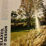
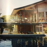
Photos from Martha Stewart’s Living July/August 2015.  Photos by Mikkel Vang.

The feature story from the most recent issue of Martha Stewart’s Living speaks to the principles of design and has a surprise, too!   Almost the entire two-page spread is a photograph of a house and its surroundings.  The CVI (Center of Visual Interest) is clear; wouldn’t you want to live here?  The choice of a panoramic view, eliminating the gutter, is a wise one.  It is how the layout achieves balance.  The angular, geometric structure of the house with its clearly vertical and horizontal lines is beautifully balanced by the fluffy foliage dominating the left-hand side of the photograph.  There is a hint of wind in the way the sea grass moves toward the right, while the house stops its flow off the page.  The grass almost becomes a pointer, as if to say, “Look, over there, the main attraction.”  It is subtle, but movement plays throughout the scene.

Contrast emerges as well as with the different colors and values.  The pale blue of the sky overhead contrasts with the inky blue-black of the pool, the darkest part mirroring the angular lines of the house in its gently rippled surface.  Through the juxtaposition of light intensity, images and color, the scene achieves atmospheric perspective.  It is as Golombisky and Hagan say:  “Dark color values always seem closer than light ones.  Colors in the foreground have darker, richer values than colors in the distance, which tend to fade and wash out”( p. 54).

The text choices, from the unexpected vertical orientation of the headline which follows the photo’s edge and is bold sans serif, to the openly spacious type face with serifs, contribute to the unity of the layout.  The hint of blue interjected by the text choice for credits adds interest and attention, but is not overwhelming because of the font size and plain style.

In the same issue, Samsung features an advertisement for its “4-Door Flex” Refrigerator.  The entire ad screams CLEAN, organized,and “innovative,” one of the words used to describe it in the clean, white-on-dark-blue type in a band where a closed-door version, all crisp and modern, runs across the the bottom third of the ad.  With the clever word-play, “…keeping your favorite foods within reach is easy.  Maybe too easy,” Samsung emphasizes with crisp, sans serif text, the allure of the wide-open door model that occupies the top two-thirds of the grid.  The doors seem to draw the reader in, offering a color-coordinated hug.  The movement is clear.

Fridge Ad

The wide-open fridge occupies center-stage against pristine white cabinetry and stands on contrasting dark hardwood flooring.  The contrast emphasizes the message:  No frills, but class!  The contrast continues with the choices of foods displayed on the panoramic shelving.  The top, seemingly vast, compartments feature all things green—and perspective is attained using relative size and scale of items.  The values of green vary, including beverages standing elegantly in the door frame next to a pineapple, offering a color-pop, but discreet, with the top frond echoing the green.

The choice to place all these healthy, green foods in three-quarters of the fridge and the fourth, bottom-right, to fill with mouth-watering desserts, primarily red and white, with chocolate brown as the accent, is unexpected, yet a necessary contrast. (It might also be saying something about the balance one needs in a healthy diet?!)

While font choices definitely play a significant role in the design of the Living examples above, the Design Basics Index exercise “Word Portraits” (p. 241) has made me view fonts in an entirely new way.  (Who knew that word groups fonts into collections and that these collections have names:”Fixed Width;” “Fun;” “Modern;” and “Traditional,” to name a few?)  I have had fun doing this even though I am unsure about some of my choices.

TWELVE FONTS

As my husband said when he viewed the “Twelve Fonts” document, “Fonts are everything!  It wasn’t for nothing that Steve Jobs stayed on Reed’s campus after he’d dropped out to take calligraphy classes.”


Mini-Art School: What Makes It Work?

When deciding which website to evaluate for good design principles, I hedged my bets.  No one does art like MoMA, and I need all the help I can get as I navigate these unfamiliar waters of design.  The website works in so many ways, but after the tour through Krause’s basics, I am beginning to underpin my, visceral “I love this site” reaction with some rhetoric for explaining why.  I’m sure that is a goal of this course.

MoMA utilizes the grid system, but not rigidly.  The header is divided into three columns, but the columns are of different widths.  The art exhibit is featured by a complete header images which changes to a right-hand side narrower, film-strip-like series of images representing all offerings at the museum and a left-hand explanation literal “pop-up” from the bright red “Exhibitions” tab.  The navigation is unique and unexpected, defying the typical mundane grid structure.  Information POPS-UP as opposed to the expected “Drop Down.”  This works to place emphasis on the additional features.  Colors work to do this as well…red, black and white.

In the middle of the home page, the standard grid form offsets the unconventional with three evenly spaced information columns.  The fonts are consistent, varying only with bold and regular, allowing for harmony.  The hierarchy is clear from the header…the ART is predominant, but there is no dearth of the necessary “nuts and bolts” of the business.  The white background , the clean margins, contribute to the order of the space despite the variety of visual art represented in the moving images.

Flow is clear, both in the movement and in the way the eyes are drawn to the bottom, the navigation.  because it is unique, one wants to see what develops as one clicks on the stationary navigation at the bottom.  While it is an unusual approach the tags at the bottom are clean and small, echoing the font used in the information section mid-page, except in all caps.

The three different levels of the web page show clear attention to placement and emphasis, achieving visual harmony.


miniart1

Now for my foray into design…ARGH!  Her’s what I learned from doing the Mini compositions…fluency must be attained by pushing through initial resistance.  I railed against doing this, but by the last four boxes or so, I was having more freedom with my pencil.  I also wanted to be able to more effectively manage the space.  Initially all I wanted was to fill the damn rectangles!  (I have to apply this to my discipline, writing, and realize that this applies to those students I teach for whom the free writing exercises that I do with them seem like torture…like them, I’m sure, the possibility that something good will come is met with skepticism.  (I do like the feel of soft lead on thick paper and was actually pleased to find that I had kept some drawing pencils from a class I took many years ago…not that I’ve used them since then!)

The Mutts

By Joseph Mischyshyn + ArséniureDeGallium [CC BY-SA 2.0 (http://creativecommons.org/licenses/by-sa/2.0)], via Wikimedia Commons                                guitar

“Guitard Epiphone 03” by Rama – Own work. Licensed under CC BY-SA 2.0 fr via Wikimedia Commons – https://commons.wikimedia.org/wiki/File:Guitard_Epiphone_03.jpg#/media/File:Guitard_Epiphone_03.jpg                                        bass

By Steve Snodgrass from Shreveport, USA (Texmaniac Uploaded by AlbertHerring) [CC BY 2.0 (http://creativecommons.org/licenses/by/2.0)], via Wikimedia Commons                   drums

Web-Site Evaluation: Intro to Web Tools


Here it is, the last REQUIRED blog post for the Introduction to Teaching with Digital Tools at Rutgers, my first online course ever .  I emphasize “required” because I have much to say about the course itself, but I’ll save that for another day!  My purpose here is to reflect on my experience of creating a website for this class.

When I first considered this assignment, I did not want to create yet another online place for my eighth grade students when each of them already has a blog linked to our class blog.  As I added to what I knew about technology integration, however, I realized that a blog, while definitely a website, is not designed for the kind of work that I wanted my students to complete, and share, for their Book Clubs.  To that end, I created Join the Clubs! using Google Sites.  Before I chose Sites, I visited one of Dr. Beaudry’s former student’s site (just as you may be doing now if you’re reading this).  In her reflection, she advised anyone using Google Sites not to get hung up on appearance and thus convinced me to give it a try.

I will be honest, I am proud of what I have done, and after about five hours of instruction with Mike Ravenek, I have begun site construction—and envision what the finished site could be—however, the way it looks does not please me.  I know the fault is mine.  I am so busy thinking about content, that appearance sits low my list of priorities.  I have struggled and failed to add a Voki with an embed code despite  yet another youtube tutorial. I would love to integrate Voki into my site, and the students’ repertoire, but embedding it has been FRUSTRATING!  Generally this is my  common initial experience with any new tech tool.  Fortunately I have grit!

What I have discovered, the definite advantage of Sites, is the way it seamlessly incorporates links from Google Drive and youtube, as well as other options, into its pages.  Students will easily be able to contribute, and because my students will be using Drive as their primary collaborative space, this feature outweighs my disappointment with the site’s lack of visual appeal.  Additionally, while the option to edit page settings within the site can be cumbersome to manage, once I understood how it works, the advantage of being able to alter individual pages to include editors added appeal for my purposes.  I originally envisioned this space as a place for the different Clubs to put their work and teach others.  Sites will be perfect for this.  When you visit the site, you will see that this is what I have done, for example, with the vocabulary videos.  Ravenek (tempted to call him “Mike” after all our time together) urges creators to link rather than embed to save storage space.  It works for me despite aesthetic drawbacks.

As far as the kids are concerned, however, if they were interested in a more artistic approach, I would urge them to use Weebly.  Three years ago my classes created themed magazines.  (I vividly remember many of them having difficulty in transferring some of their work from Drive to Weebly though, and these were singular projects rather than collaborative.)  Yesterday I reviewed some of them and was impressed with their content as well as the aesthetic.  I am linking to Emma’s and Sophie’s, so you can see what I mean.  They are both password-protected, so use “versatile” if prompted.  I think you’ll see the difference.  The students have artistic flexibility, and as a student in the web-design class I am taking now said, “Hey, it’s pretty much ‘drag-and-drop’ but looks really good.”

A solid take-away from this course is that it is not about the technology; the tech is a tool.  It is about leveraging the tool to get the learning.  I think Sites does that for me in this case.