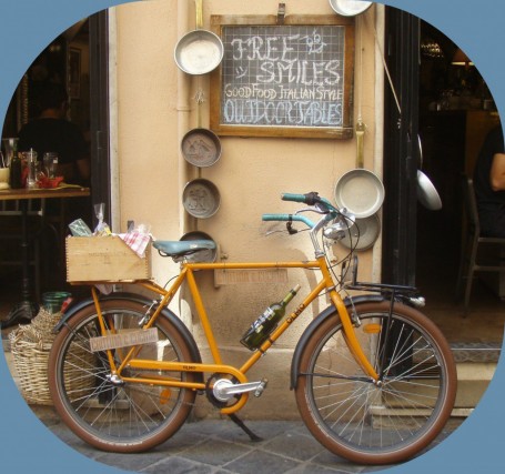
 I am using a free online photo editor, REBBIT, and its options are not huge, but I did get to play enough with color and width choices, as well as shape, to understand the effect that edge treatments have on the overall impact of an image. Here the “polaroid” effect detracts from the simplicity of the shot, but I like the blue to pick up the color in the bike seat, handlebar grips, and bricks, which lost a lot of gray with this edge treatment (new term: spontaneous contrast).
 Here the border frame is partial, corners only, but still trying to work with the effect of blue. As I deepened the corners, adding more edge, less photo, the importance shifted back to the bike, a bit like a telescope.
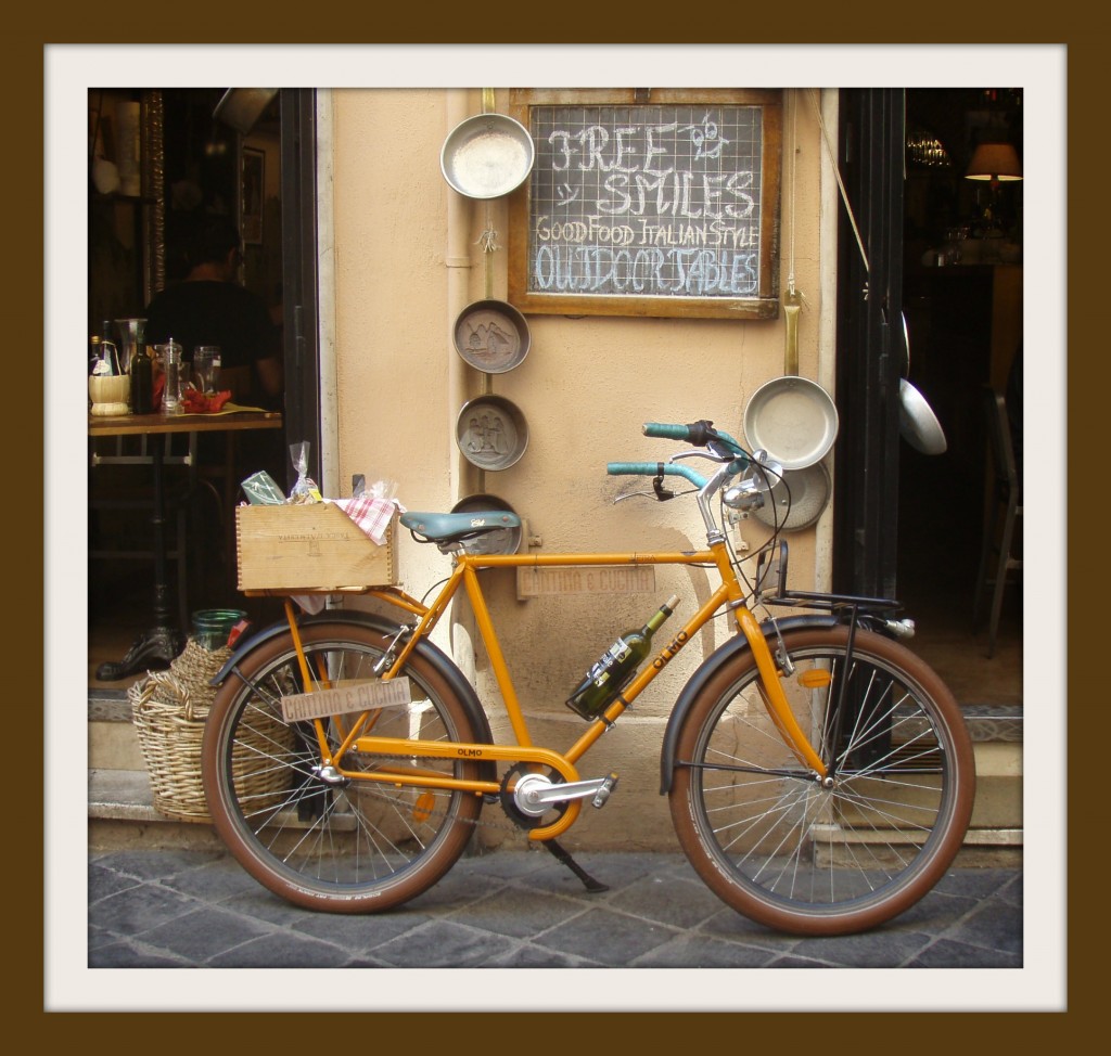 This “museum” framing effect looks better at the site than in the transfer. The vertical edges should be the same width as the top and the bottom. The brown draws less attention to itself and goes well with the brown of the tires and the soft yellows and deeper gold color of the bike frame. The entire scene, menu, pots, bike, appears more even in value in this frame. Yes, the bike is the focal point, but it seems a part of the larger scene.
 This is a variation on the museum framing idea. Once again, the vertical edges are misrepresented here. What I notice about this frame’s effect is the way the color of the bicycle frame “pops” because of the addition of the color in the border. I really like the effect.
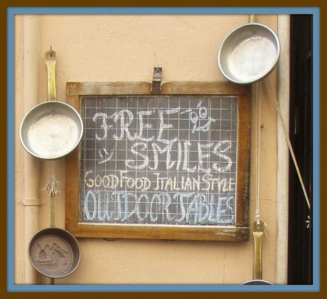
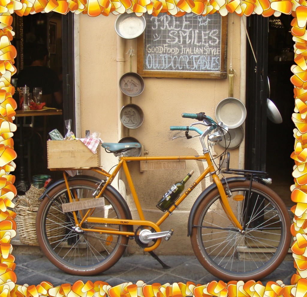 In the last paragraph of the exercise, Krause says, “And remember: a border’s role is (almost always)to enhance the image it surrounds–avoid adding a border that calls too much attention to itself” (p.197). Obviously this is an example of a border that, in tone, bears absolutely no connection to the bicycle even though the candy corn hues aren’t jarring against the colors and hues of the photograph. It was only after I completed the reading today about working with images, that I revisited the original photo and decided to experiment with “tight cropping.” As White Space Is Not Your Enemy advised on page 134, “Extreme tight crops and close-ups are particularly interesting, as they force us to look at the subject in a new way” (Golombisky & Hagen). When I cropped and zoomed with this idea in mind, the bike disappeared and the reason that the candy-corn frame serendipitously has some merit, emerges, as you can see below. (I am sure that it was the sign that prodded, “Take this shot!” What a great way to remember our day in Rome.)
The idea that a different picture emerges when one plays with framing and particularly cropping, is part of what creates thematic force. In designing a cover for a new young adult novel, Flirting with the Bully, I had to think about my audience and how symbolically and poetically I could create a compelling cover. I have to give a HUGE nod to the incredibly brilliant “Let the Drummer Kick” (Citizen Cope) that exhibits the power of creativity with type (and the judicious use of only three colors to attain stunning effect):
Here’s my cover:
For those of you who have never used Canva (thanks to Richard Byrne here), check it out. After only four tutorials, I got the hang of it!
(I just realized, in reading my peers’ posts, that I was supposed to complete three activities this week, but did not. What to do? I sit here facing the iconic azure and gentle surf of the Dominican Republic…without my texts. I decided, rather than ignore my oversight, to design a new header for my eighth grade class blog, using design principles, color, text, and images to do so. I hope it in some way suffices. I need to work out some glitches; the problem is mine, not Canva’s, but once again, the finished product points to a certain lack of skill that exists despite the affordances of the technology.)
Hi Trish,
Great job on the borders. I looked at Rebbit, but I had some trouble figuring out how to use it. How did you learn how to use it? I like the borders you chose. Some of them look similar to ones I used in mine, but the last one looks different and unique.
Interesting take on the Flirting with the Bully book cover. It seemed very modern and prevalent to the current age of students.
Great job!
Thank you, Patricia, for introducing me to some new tools. I used my old standard PrintShop to complete this exercise and was wondering how anyone else was going to manage to accomplish it without purchasing a similar program. Silly me! Of course there’s an app for that!
Your thumbnail images above are clickable and will open a full version, FYI. So we can see how the images were intended to look. I LOVE the plain brown museum frame. It looks very sharp and realistic.
Giving digital photos the polaroid treatment is one of my favorite things to do. I even used this on my wedding album cover, which I designed myself. See it here: https://docs.google.com/drawings/d/1OBGOFSPVrAimX79fSnjVGcfWD_07mM38BlM3ut2ZICU/edit?usp=sharing
I love the colors in your novel cover and how you rotated your image and text. You did a good job of creating that “sense of unease” they talk about in the White Space text.
I wonder what the significance of YouGotMail.mp3 is. Is that the name of an app that delivers notifications? With the file extension.mp3 it seems like it’s a song.
I love the white space created by the main portion of the screen, but also wonder why it’s blank–maybe to indicate a message that hasn’t yet been written. I am unfamiliar with this phone’s OS.
Great job overall!