Design Elements and Principles
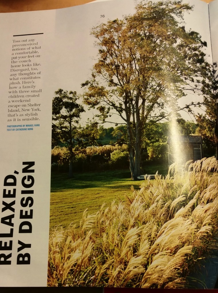

Photos from Martha Stewart’s Living July/August 2015. Photos by Mikkel Vang.
The feature story from the most recent issue of Martha Stewart’s Living speaks to the principles of design and has a surprise, too! Almost the entire two-page spread is a photograph of a house and its surroundings. The CVI (Center of Visual Interest) is clear; wouldn’t you want to live here? The choice of a panoramic view, eliminating the gutter, is a wise one. It is how the layout achieves balance. The angular, geometric structure of the house with its clearly vertical and horizontal lines is beautifully balanced by the fluffy foliage dominating the left-hand side of the photograph. There is a hint of wind in the way the sea grass moves toward the right, while the house stops its flow off the page. The grass almost becomes a pointer, as if to say, “Look, over there, the main attraction.” It is subtle, but movement plays throughout the scene.
Contrast emerges as well as with the different colors and values. The pale blue of the sky overhead contrasts with the inky blue-black of the pool, the darkest part mirroring the angular lines of the house in its gently rippled surface. Through the juxtaposition of light intensity, images and color, the scene achieves atmospheric perspective. It is as Golombisky and Hagan say: “Dark color values always seem closer than light ones. Colors in the foreground have darker, richer values than colors in the distance, which tend to fade and wash out”( p. 54).
The text choices, from the unexpected vertical orientation of the headline which follows the photo’s edge and is bold sans serif, to the openly spacious type face with serifs, contribute to the unity of the layout. The hint of blue interjected by the text choice for credits adds interest and attention, but is not overwhelming because of the font size and plain style.
In the same issue, Samsung features an advertisement for its “4-Door Flex” Refrigerator. The entire ad screams CLEAN, organized,and “innovative,” one of the words used to describe it in the clean, white-on-dark-blue type in a band where a closed-door version, all crisp and modern, runs across the the bottom third of the ad. With the clever word-play, “…keeping your favorite foods within reach is easy. Maybe too easy,” Samsung emphasizes with crisp, sans serif text, the allure of the wide-open door model that occupies the top two-thirds of the grid. The doors seem to draw the reader in, offering a color-coordinated hug. The movement is clear.
The wide-open fridge occupies center-stage against pristine white cabinetry and stands on contrasting dark hardwood flooring. The contrast emphasizes the message: No frills, but class! The contrast continues with the choices of foods displayed on the panoramic shelving. The top, seemingly vast, compartments feature all things green—and perspective is attained using relative size and scale of items. The values of green vary, including beverages standing elegantly in the door frame next to a pineapple, offering a color-pop, but discreet, with the top frond echoing the green.
The choice to place all these healthy, green foods in three-quarters of the fridge and the fourth, bottom-right, to fill with mouth-watering desserts, primarily red and white, with chocolate brown as the accent, is unexpected, yet a necessary contrast. (It might also be saying something about the balance one needs in a healthy diet?!)
While font choices definitely play a significant role in the design of the Living examples above, the Design Basics Index exercise “Word Portraits” (p. 241) has made me view fonts in an entirely new way. (Who knew that word groups fonts into collections and that these collections have names:”Fixed Width;” “Fun;” “Modern;” and “Traditional,” to name a few?) I have had fun doing this even though I am unsure about some of my choices.
As my husband said when he viewed the “Twelve Fonts” document, “Fonts are everything! It wasn’t for nothing that Steve Jobs stayed on Reed’s campus after he’d dropped out to take calligraphy classes.”
Mini-Art School: What Makes It Work?
When deciding which website to evaluate for good design principles, I hedged my bets. No one does art like MoMA, and I need all the help I can get as I navigate these unfamiliar waters of design. The website works in so many ways, but after the tour through Krause’s basics, I am beginning to underpin my, visceral “I love this site” reaction with some rhetoric for explaining why. I’m sure that is a goal of this course.
MoMA utilizes the grid system, but not rigidly. The header is divided into three columns, but the columns are of different widths. The art exhibit is featured by a complete header images which changes to a right-hand side narrower, film-strip-like series of images representing all offerings at the museum and a left-hand explanation literal “pop-up” from the bright red “Exhibitions” tab. The navigation is unique and unexpected, defying the typical mundane grid structure. Information POPS-UP as opposed to the expected “Drop Down.” This works to place emphasis on the additional features. Colors work to do this as well…red, black and white.
In the middle of the home page, the standard grid form offsets the unconventional with three evenly spaced information columns. The fonts are consistent, varying only with bold and regular, allowing for harmony. The hierarchy is clear from the header…the ART is predominant, but there is no dearth of the necessary “nuts and bolts” of the business. The white background , the clean margins, contribute to the order of the space despite the variety of visual art represented in the moving images.
Flow is clear, both in the movement and in the way the eyes are drawn to the bottom, the navigation. because it is unique, one wants to see what develops as one clicks on the stationary navigation at the bottom. While it is an unusual approach the tags at the bottom are clean and small, echoing the font used in the information section mid-page, except in all caps.
The three different levels of the web page show clear attention to placement and emphasis, achieving visual harmony.
Now for my foray into design…ARGH! Her’s what I learned from doing the Mini compositions…fluency must be attained by pushing through initial resistance. I railed against doing this, but by the last four boxes or so, I was having more freedom with my pencil. I also wanted to be able to more effectively manage the space. Initially all I wanted was to fill the damn rectangles! (I have to apply this to my discipline, writing, and realize that this applies to those students I teach for whom the free writing exercises that I do with them seem like torture…like them, I’m sure, the possibility that something good will come is met with skepticism. (I do like the feel of soft lead on thick paper and was actually pleased to find that I had kept some drawing pencils from a class I took many years ago…not that I’ve used them since then!)
By Joseph Mischyshyn + ArséniureDeGallium [CC BY-SA 2.0 (http://creativecommons.org/licenses/by-sa/2.0)], via Wikimedia Commons guitar
“Guitard Epiphone 03” by Rama – Own work. Licensed under CC BY-SA 2.0 fr via Wikimedia Commons – https://commons.wikimedia.org/wiki/File:Guitard_Epiphone_03.jpg#/media/File:Guitard_Epiphone_03.jpg bass
By Steve Snodgrass from Shreveport, USA (Texmaniac Uploaded by AlbertHerring) [CC BY 2.0 (http://creativecommons.org/licenses/by/2.0)], via Wikimedia Commons drums
Web-Site Evaluation: Intro to Web Tools
Here it is, the last REQUIRED blog post for the Introduction to Teaching with Digital Tools at Rutgers, my first online course ever . I emphasize “required” because I have much to say about the course itself, but I’ll save that for another day! My purpose here is to reflect on my experience of creating a website for this class.
When I first considered this assignment, I did not want to create yet another online place for my eighth grade students when each of them already has a blog linked to our class blog. As I added to what I knew about technology integration, however, I realized that a blog, while definitely a website, is not designed for the kind of work that I wanted my students to complete, and share, for their Book Clubs. To that end, I created Join the Clubs! using Google Sites. Before I chose Sites, I visited one of Dr. Beaudry’s former student’s site (just as you may be doing now if you’re reading this). In her reflection, she advised anyone using Google Sites not to get hung up on appearance and thus convinced me to give it a try.
I will be honest, I am proud of what I have done, and after about five hours of instruction with Mike Ravenek, I have begun site construction—and envision what the finished site could be—however, the way it looks does not please me. I know the fault is mine. I am so busy thinking about content, that appearance sits low my list of priorities. I have struggled and failed to add a Voki with an embed code despite yet another youtube tutorial. I would love to integrate Voki into my site, and the students’ repertoire, but embedding it has been FRUSTRATING! Generally this is my common initial experience with any new tech tool. Fortunately I have grit!
What I have discovered, the definite advantage of Sites, is the way it seamlessly incorporates links from Google Drive and youtube, as well as other options, into its pages. Students will easily be able to contribute, and because my students will be using Drive as their primary collaborative space, this feature outweighs my disappointment with the site’s lack of visual appeal. Additionally, while the option to edit page settings within the site can be cumbersome to manage, once I understood how it works, the advantage of being able to alter individual pages to include editors added appeal for my purposes. I originally envisioned this space as a place for the different Clubs to put their work and teach others. Sites will be perfect for this. When you visit the site, you will see that this is what I have done, for example, with the vocabulary videos. Ravenek (tempted to call him “Mike” after all our time together) urges creators to link rather than embed to save storage space. It works for me despite aesthetic drawbacks.
As far as the kids are concerned, however, if they were interested in a more artistic approach, I would urge them to use Weebly. Three years ago my classes created themed magazines. (I vividly remember many of them having difficulty in transferring some of their work from Drive to Weebly though, and these were singular projects rather than collaborative.) Yesterday I reviewed some of them and was impressed with their content as well as the aesthetic. I am linking to Emma’s and Sophie’s, so you can see what I mean. They are both password-protected, so use “versatile” if prompted. I think you’ll see the difference. The students have artistic flexibility, and as a student in the web-design class I am taking now said, “Hey, it’s pretty much ‘drag-and-drop’ but looks really good.”
A solid take-away from this course is that it is not about the technology; the tech is a tool. It is about leveraging the tool to get the learning. I think Sites does that for me in this case.
Why Join a Community?
It’s summer, and one of the tasks I undertake is retyping the list of usernames and passwords for all the online places I frequent. I update twice a year now…and today is the day! I have added so many new “tools” and communities. Do I need to access yet another? It depends on what I want to learn, so perhaps. Is it possible, however, that I have yet to fully explore communities to which I already belong, that within this trove I’ve cached, there lie the resources that could help me with my multimedia montage project (MMP)? “Yes!” is the resounding answer.
I have joined our class community on google+ and added Teachercast Educational Broadcasting and PBL (Project-Based Learning) as well. Then I scour my go-to places list to find that Pinterest has edudemic with a collection specifically devoted to web-design that looks promising for a newbie like me. In addition, edweb, a familiar landscape, has amazing resources in communities such as “Game-Based Learning” and “Creating Multimedia Stories” that I might never have discovered were it not required that I go looking.
The course I will be finishing in the next two weeks, “Introduction to Teaching with Digital Tools,” has familiarized me with ADDIE to a degree. Today, as I was looking at LDC.org, I realize that the way the design of lessons is outlined follows the principles of Analysis, Design, Development, Implementation, and Evaluation in a simplified form. Now I am seeing design principles everywhere. (This morning my yoga teacher had asked, “Has anyone ever had the experience of watching a movie for the 10th time and seeing or hearing something for the first time? You were at a different place the other nine times…Now you are here!”) And so I am!
Because I intend the audience for the MMP to be my seventh and eighth grade book clubs, and envision going through the steps with the model text that they will be going through, all of Jeff Bradbury’s help, particularly technical, will be invaluable. I want to have my students using the skills that they already use in their extra-curricular lives (Walker, Jameson & Ryan as cited in Sharpe, Beetham & de Frietas, 2010, p. 213) in the structure of our learning environment.
The book clubs will be addressing the essential question,”What Is Justice?” through their study of different texts. (I see “driving” question on the PBL site, and think they may be similar, but am too ignorant yet to answer definitively.) The texts they will choose from, predominantly novels, explore different responses to injustice. Their “Take-Away” projects are what I want to address through the MMP. The website will display the work of the students and allow them the freedom of presentation options, the how. To a large extent, they will also select the content, what they choose to examine. As Walker, Jameson, and Ryan asserted, “There is significant value in learners bringing to their academic studies these habits of selecting and appropriating materials, seeing and creating new patterns of meaning, and sharing information in creative ways” (as cited in Sharpe et al. p. 217). The students will be building understanding, not just for themselves, but to share with the larger community, those who did not read the same text. Furthermore, the essential question is being used across the eighth grade disciplines throughout the year. Hopefully the work, and the methodology, regardless of the class in which it happens, will transfer. I know I will be teaching for that.
Introduction
“Create a podcast,” the introduction to the new course, “Web-Based Multimedia Design” says. “I encourage you to shake things up a bit!” Oh, my gosh. I am so “beyond my comfort zone” that I can’t even access the Google+ community to which I am to post the podcast, so I will post it here, as evidence that I have completed it and hope I can access the community soon. In addition, I have created an Animoto video—nothing particularly brilliant. What am I going for? Survival, and as the gracious professor reassures, former students say this course has caused them to see the world differently. Isn’t that at the heart of true learning?
Week Four: And There’s More
Have to include a link to fellow blogger that covers the development of podcasting and vlogging. Why? Because I just received an email from the professor of the next course I am taking this summer—“Web-Based Multi-Media Design,” and these two formats figure prominently.
When I was in New Orleans, my son mentioned Dan Carlin’s Hardcore History, particularly the podcasts about how WWI shaped the America we know today. I told myself that I’d listen to the 6+ hours over the summer, and I will. I certainly intend to check these other sites as well. After hearing about Matt Shepard Is a Friend of Mine showing at the White House, I know I want to listen to the youth blogger about LGBT issues, too. He might definitely appeal to my younger (eighth grade) students; I’ll have to check it out! (Isn’t learning great?)
Insights in Week Three
This week finds us blogging as part of the class requirements, and I think about the blogging requirements I ask of my students. I also recall my first mortifying technology class over a decade ago when I was beginning my Masters degree at Rutgers. I sat in the darkest recesses of the computer lab and cried through several sessions. I had never been the least capable student, or at least had never personally felt that way, but that class gave me that feeling. It was humbling, and at the same time, one of the most important experiences of my graduate school career. I swore I would hold that self-doubt and second-guessing about my own ability and recall it whenever I questioned a student’s aptitude in the classes I would teach. Time passes, though, and the power of immediacy diminishes.
Yesterday when I reviewed the assignments in this week’s module, I thought again about how tricky it is to teach when everyone is in a different place along the continuum. (I greatly appreciate our professor’s introductory survey to gain an understanding of our expertise and use of technology and realize that I need to do the same.) When I began my graduate studies, I knew nothing about technology– hence the lab meltdowns. Now after several years of pledging to upgrade my awareness and proficiency with digital tools, I’m gaining confidence, but much of this is still not natural for me. In fact, I just tried to post to the Padlet—yes I signed up when it was “Wallwisher”—but I still hadn’t used it, and found myself stymied. I read the “help” but doubt that my link will show the page. ARGH! Frustration, my old friend. Hear me, fellow students, I am no stranger to gnashing-of-teeth! A truth about technology use: one has to find tools that will actually maximize performance. The goal is to learn, not to mystify.
That brings me to my own students, many of whom have never used any of the tools I introduce and espouse during their semester in 151 despite the fact that the majority of them qualify as digital natives. Having made the assumption that my college students would be familiar and adept with all the tools I use as a matter of course, the irony that that is not the case because working with technology is not a genetic trait but must be taught as the linked video asserts resonates. I have had stunned 20-year-olds say they never expected someone like me (translate: OLD!) to be so “up on the technology.” Furthermore, for many of them, the idea that I would want to see all their work in Drive, so I could comment before they submit a draft was more than they had bargained for. They resist the power of tool.
When a new semester begins next fall, I hope to be working with a fellow adjunct who has expressed enthusiasm, or at least a willingness, for our two classes to blog together. I am excited about this. Another aspect of technology integration is that colleagues must also be willing to share. With all the opportunities for collaboration that new technology affords, it is astounding that I am not aware of them on my campus. If I stay with this level of teaching for another decade or so, and if the Common Core endures, I wonder if my future students, as well as my colleagues, will be as prepared as the standards envision. I hope so!
Forever Present: Online Courses
I took my two remaining “personal days,” and paid for two additional days, to visit my son in New Orleans. While this was a much-needed vacation, coursework traveled with me, making it time away, but not without work. This is the boon and bane of learning online. I am not unfamiliar with the electronic omnipresence, the work that can always be viewed in Google Drive if students have remembered to put it in their shared folders. Never, however, have I been on the “student” end of it.
Today, upon my return to the comfort of my own desk, my environs, I experience more than a single moment of panic. When a professor posts a video urging students to be completely aware of the intense workload that they will have to bear, I am not immune to panic…and so, I succumbed. PANIC and self-doubt inundated me. Can I do this? What do I need to do first? Do I have time? Can I do this and my regular job? Fortunately my familiarity with this self-doubt, and my track record of success where academics is concerned, balanced the terror. I countered with my insecurity with positive self-talk and now think I can, a lot like the little engine that could. But for several moments there, I was forced to think like my students must think when confronted with a set of tasks that either in sheer volume seem impossible or in their complexity and newness pose a daunting challenge.
The OCC handbook provides guidelines for students and suggests that a student will likely spend an additional hour and a half for each hour spent in class. With an in-class schedule requiring 2 1/2 hours, that means an average of about 4 hours outside of class. We, the members of the online class I am taking now have been told that the class demands approximately 15 committed hours each week. I can safely say now that 15 hours will not suffice for me. Do I think I am the exception, that I am less capable than others? No, but I know, based on the time spent thus far gaining a grasp of Module 2, that 15 hours is a conservative number.
In an insightful blog post, Linda Aragoni discusses the mistake that writers, as well as everyone else, commonly make in underestimating the time it will take to get something accomplished. She suggests that those of us who teach writers need to divide writing tasks into five manageable “stages,” so students can look at the actual time spent at each stage in order to become more accurate at budgeting time overall. I know that I always take more time than others require. Writing is an elaborate and difficult process for me at any time, and this time the subject and its delivery demand more of me than usual. This will be a case of, “If something can go wrong, it will.” I’ll keep you posted.
Back-to-School
This summer, specifically today, I begin my stint as a student, working toward a certificate in Educational Technology from Rutgers University. I know how helpful this will be for me not only because I will learn more about what is available for use with my students (perhaps you?), but more importantly, I will BE a student, subject to the frustration and demands that extra work and commitment can bring when it seems that my life is already full-to-bursting. The first online class, “Introduction to Teaching with Digital Tools,” opened today, Memorial Day, and already the professor has introduced an important infographic that bears on the work we will do in 151. I am sharing this journey on my blog, so my students will know that life is an always-learning adventure, “a marathon, not a sprint,” in the words of Angela Duckworth.
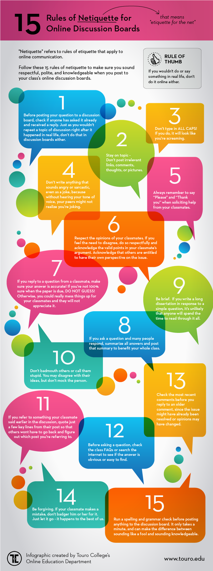
Please include attribution to the Online Education Blog of Touro College with this graphic.