
Photos from Martha Stewart’s Living July/August 2015. Photos by Mikkel Vang.
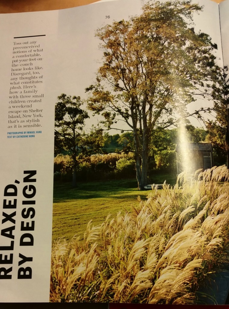
The feature story from the most recent issue of Martha Stewart’s Living speaks to the principles of design and has a surprise, too! Almost the entire two-page spread is a photograph of a house and its surroundings. The CVI (Center of Visual Interest) is clear; wouldn’t you want to live here? The choice of a panoramic view, eliminating the gutter, is a wise one. It is how the layout achieves balance. The angular, geometric structure of the house with its clearly vertical and horizontal lines is beautifully balanced by the fluffy foliage dominating the left-hand side of the photograph. There is a hint of wind in the way the sea grass moves toward the right, while the house stops its flow off the page. The grass almost becomes a pointer, as if to say, “Look, over there, the main attraction.” It is subtle, but movement plays throughout the scene.
Contrast emerges as well as with the different colors and values. The pale blue of the sky overhead contrasts with the inky blue-black of the pool, the darkest part mirroring the angular lines of the house in its gently rippled surface. Through the juxtaposition of light intensity, images and color, the scene achieves atmospheric perspective. It is as Golombisky and Hagan say: “Dark color values always seem closer than light ones. Colors in the foreground have darker, richer values than colors in the distance, which tend to fade and wash out”( p. 54).
The text choices, from the unexpected vertical orientation of the headline which follows the photo’s edge and is bold sans serif, to the openly spacious type face with serifs, contribute to the unity of the layout. The hint of blue interjected by the text choice for credits adds interest and attention, but is not overwhelming because of the font size and plain style.
In the same issue, Samsung features an advertisement for its “4-Door Flex” Refrigerator. The entire ad screams CLEAN, organized,and “innovative,” one of the words used to describe it in the clean, white-on-dark-blue type in a band where a closed-door version, all crisp and modern, runs across the the bottom third of the ad. With the clever word-play, “…keeping your favorite foods within reach is easy. Maybe too easy,” Samsung emphasizes with crisp, sans serif text, the allure of the wide-open door model that occupies the top two-thirds of the grid. The doors seem to draw the reader in, offering a color-coordinated hug. The movement is clear.
The wide-open fridge occupies center-stage against pristine white cabinetry and stands on contrasting dark hardwood flooring. The contrast emphasizes the message: No frills, but class! The contrast continues with the choices of foods displayed on the panoramic shelving. The top, seemingly vast, compartments feature all things green—and perspective is attained using relative size and scale of items. The values of green vary, including beverages standing elegantly in the door frame next to a pineapple, offering a color-pop, but discreet, with the top frond echoing the green.
The choice to place all these healthy, green foods in three-quarters of the fridge and the fourth, bottom-right, to fill with mouth-watering desserts, primarily red and white, with chocolate brown as the accent, is unexpected, yet a necessary contrast. (It might also be saying something about the balance one needs in a healthy diet?!)
While font choices definitely play a significant role in the design of the Living examples above, the Design Basics Index exercise “Word Portraits” (p. 241) has made me view fonts in an entirely new way. (Who knew that word groups fonts into collections and that these collections have names:”Fixed Width;” “Fun;” “Modern;” and “Traditional,” to name a few?) I have had fun doing this even though I am unsure about some of my choices.
As my husband said when he viewed the “Twelve Fonts” document, “Fonts are everything! It wasn’t for nothing that Steve Jobs stayed on Reed’s campus after he’d dropped out to take calligraphy classes.”